Identity Designed #002
I wanted to share the classic “Tate by Tube” poster, designed by David Booth back in the late 80s.
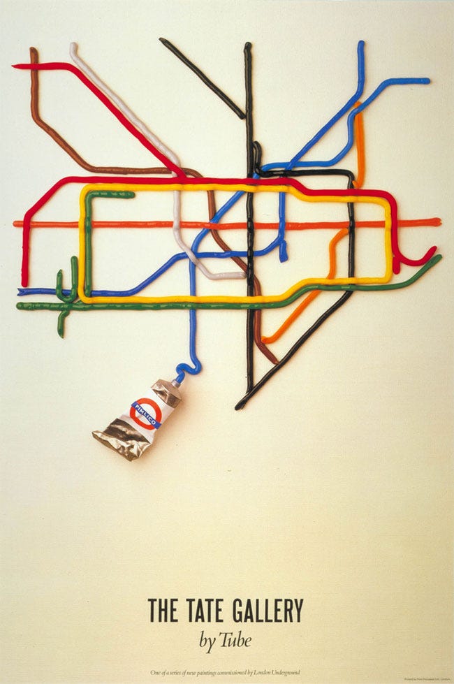
The paint tube shows the name (Pimlico) and map location of the Tate Gallery’s nearest station. Semi-related, here’s a brief history of the London Underground logo.
As always, many thanks for reading.
Latest from Identity Designed


September Café & Cake is a Saigon-based coffee shop established in 2019. The symbol is based on the interaction of two ovular windows from within the café premises, “as if two individuals are leaning on each other, supporting each other.”
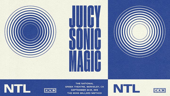
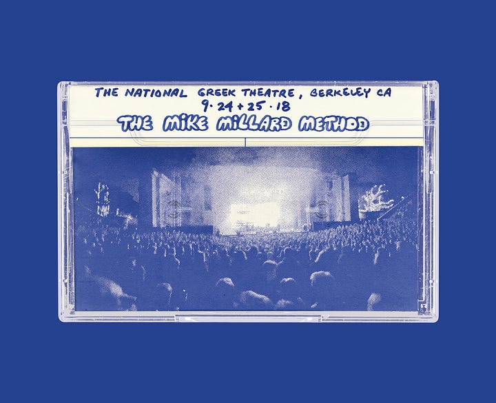
Juicy Sonic Magic is a triple-cassette box-set for The National, in honour of Mike “the Mike” Millard’s handmade tape aesthetic, circa 1975–81. “We merged nostalgic halftone illustrations with contemporary typography — utilising Plaak and Apercu — to create a packaging system that feels both modern and rooted in history.”
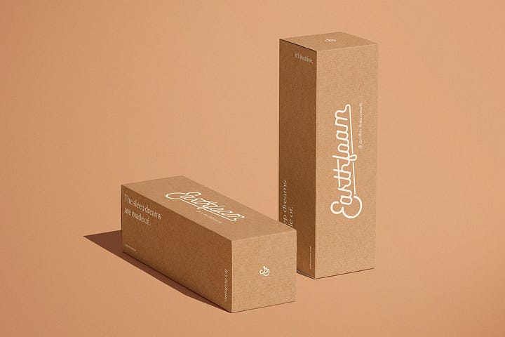

Earthfoam is a sustainable sleep brand aiming to raise the standards of quality, comfort, durability, and transparency within a misunderstood category. “When we mixed the script logo within this system, and incorporated some Sinhala — the language primarily spoken by the Sinhalese people of Sri Lanka where the Earthfoam rubber is sourced — everything worked together in this almost illogical way.”
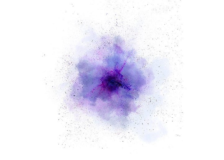

And a favourite from the archives, Tamarind of Mayfair was the first Indian restaurant in London to receive a Michelin star. A “floral” visual language was created, loosely inspired by the Holi festival and smoke from the tandoor. Dutchscot commissioned and art directed John Ross on the photography of the “powder flowers.”
Latest from Logo Design Love
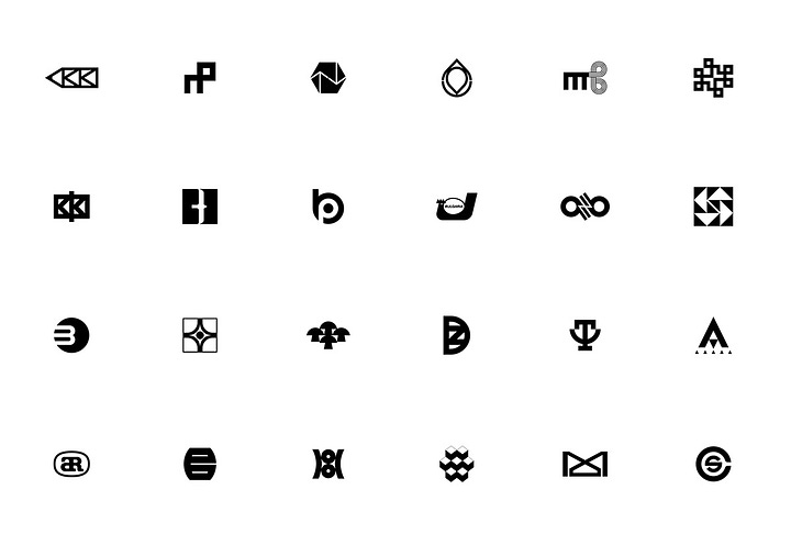
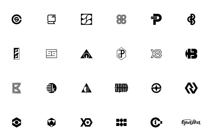
ABVA is a digital archive of the Bulgarian visual arts. A self-funded project, the team behind ABVA “documents, stores, studies, and popularises examples of different visual arts from Bulgaria.” The collection of Bulgarian logos was particularly interesting, with some lovely examples of clean, minimal, distinctive symbols, and others with much more detail and character.
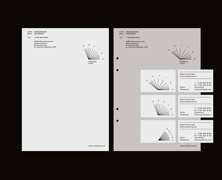
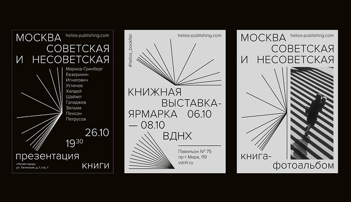
An eye-catching logo for Helios Publishing House in Moscow, by Oksana Paley and Alice Retunsky, co-founders of Omsky. In Ancient Greek mythology, Helios is the god and personification of the sun. “Like a ray of light, books elucidate the light of knowledge. The symbol combines both images: the sun and an open book.”
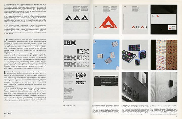
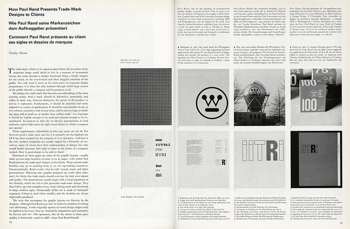
And one from the archives, how Paul Rand presented work to clients. “Rand avoids what he calls ‘sound, music and lights presentations.’ Believing that ‘graphic designers are really silent salesmen,’ he thinks that trade marks should convince by their own impact and quality.”
Last, not least
A collection of type design resources, courtesy of Justin Penner.
And TypeTrials might speed things up with your design projects. It’s a free platform to test and experiment with your fonts (or theirs). Via Mike.
There’s a lot of tasty work in the Archivio Grafica Italiana.
Head to Flickr for a lovely collection of graphic design for Olivetti, the Italian tech manufacturer founded in 1908. Thanks Antonio.
With the seemingly incessant hype about artificial intelligence, James Corbett typed some insightful thoughts on the real dangers of the chatbot takeover.
A look back at the days when work uniforms were snappy, dapper, and tailored. By Steven Heller. Before my time. But smart, indeed.
Browsing the archives of The Academy of British Cover Design, thought it worth picking out a few excellent book covers on Twitter.
Your support
Support my newsletter by recommending it to someone else, picking up one of my books, or just getting in touch to say hi — doesn’t happen often, but it’s appreciated.

