Identity Designed #004
Earlier this week I had the pleasure of sitting down in The Merchant with Blair Enns of Win Without Pitching (joined by his lovely wife Colette). Blair and I have been in touch for 15 years, but we’d yet to meet in person.
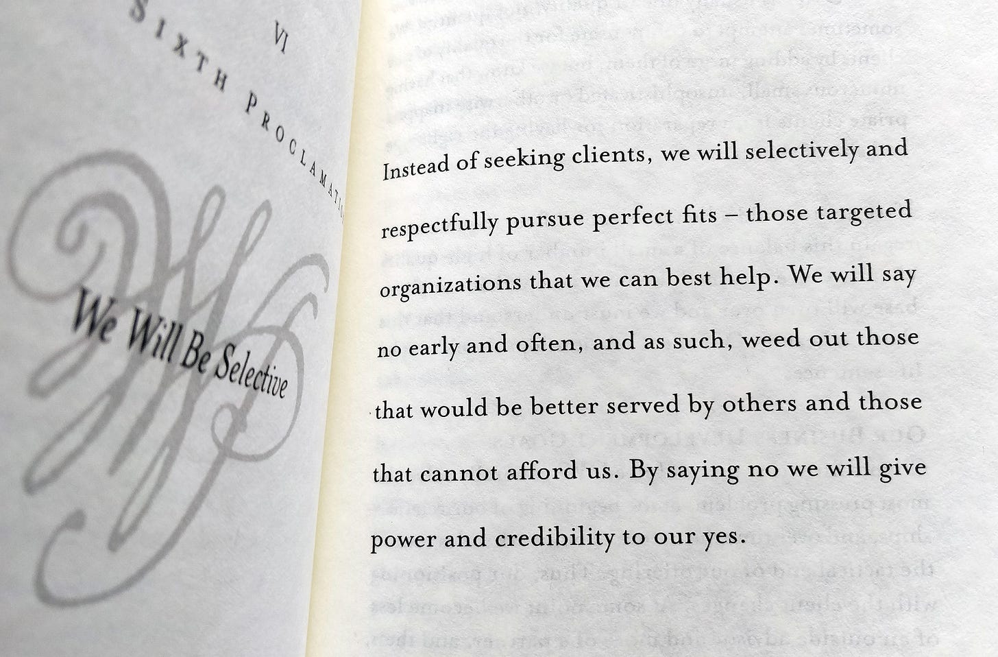
Among other things, we talked about new books, publishing versus self-publishing, digital distraction, and solo-walks across Spain. If you’ve yet to read Blair’s Manifesto, it’s excellent, highly recommended.
As always, many thanks for reading.
Latest from Identity Designed
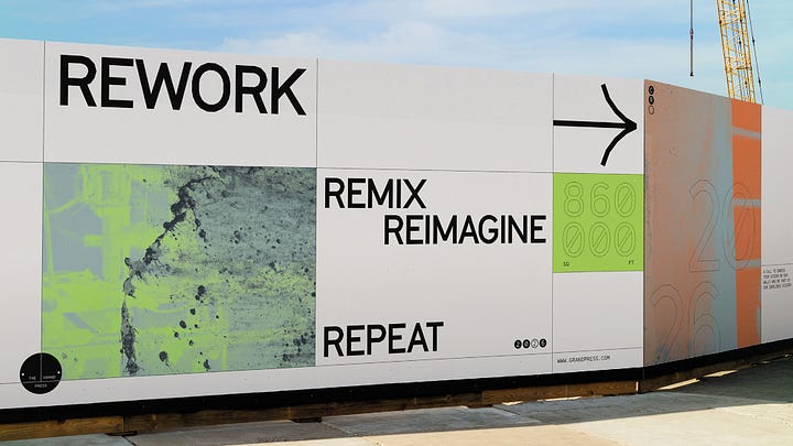
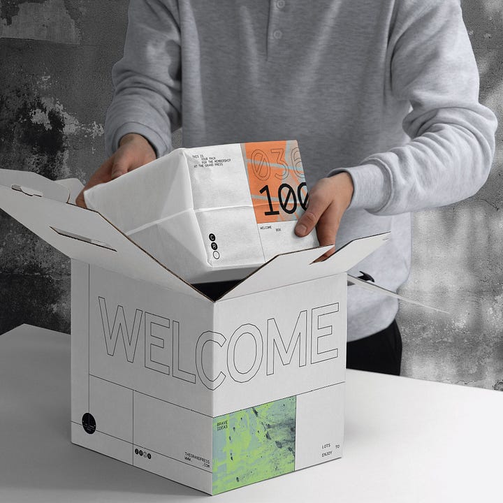
The Grand Press is a new workspace due for completion in 2026, on the site of the former Printworks London. “Graphic shapes and crisp line-work fused with distressed concrete and years of layered paint became the basis for the design system.”

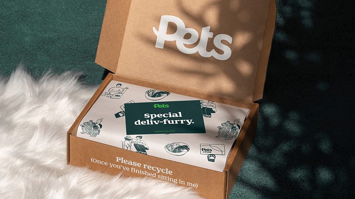
With more than 450 stores across the UK, Pets at Home are without a doubt the nation’s biggest pet-care brand. “Pet owners applied in their thousands to take part in our photoshoot for the new identity.”

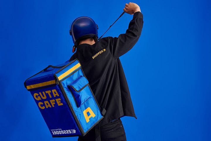
And a favourite from the archives, Guta Cafe has become one of Vietnam’s fastest-growing coffee chains. “After this rebrand, Guta has grown from several stores to nearly 60 stores around Saigon.”
And from Logo Design Love
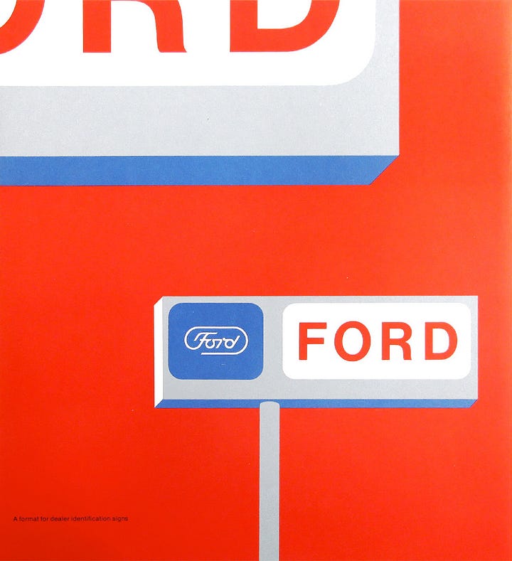
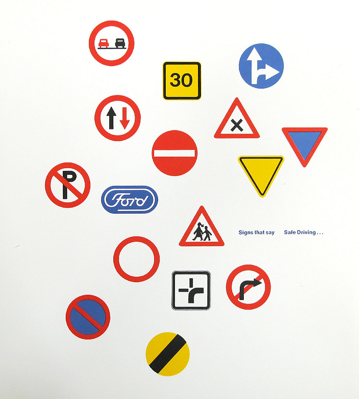
Paul Rand’s Ford presentation is a lesson in how past design masters presented their logo redesigns. “Simplicity gets to the heart of a problem. It generates awareness by its brevity, inspires confidence by its understatement, believability by its frankness, and memorability by its uniqueness. It is the embodiment of form and content.”

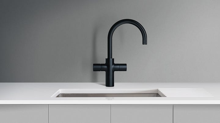
The Flipper Taps logo combines the letter F with the shape of the tap (and a plus symbol, because “more”). It’s the type of design that, in my experience, often takes considerably more persuasion when it comes to achieving client consensus than it would with a more detailed logo.


And one from the archives, the NASA logo evolution. After a NASA illustrator’s design was chosen for the official seal, James Modarelli was asked to design a logo that could be used for less formal purposes.
Last, not least…
A fascinating short video on the comic book work of Chris Ware. Via Chris Glass.
If you’re on the lookout for a creative newsletter, Guy Moorhouse is on hand with his monthly Converge. Recommended.
This rolling bridge idea caught my eye. Lovely. Via Iancu.
Just rewatched the brilliantly written Carousel scene from Mad Men.
The annoying act of telling people what you do. A lesson to be taught in school, and repeated every so often. Via Jocelyn.
I’ll often listen to ambient music while working — something atmospheric, calming. Jeremy Soule’s Skyrim soundtrack fits the bill.
Your support
You can support my humble newsletter by recommending it to others, buying one of my books, even just getting in touch to say hi (always a pleasure to hear from readers).

