
Identity Designed #006
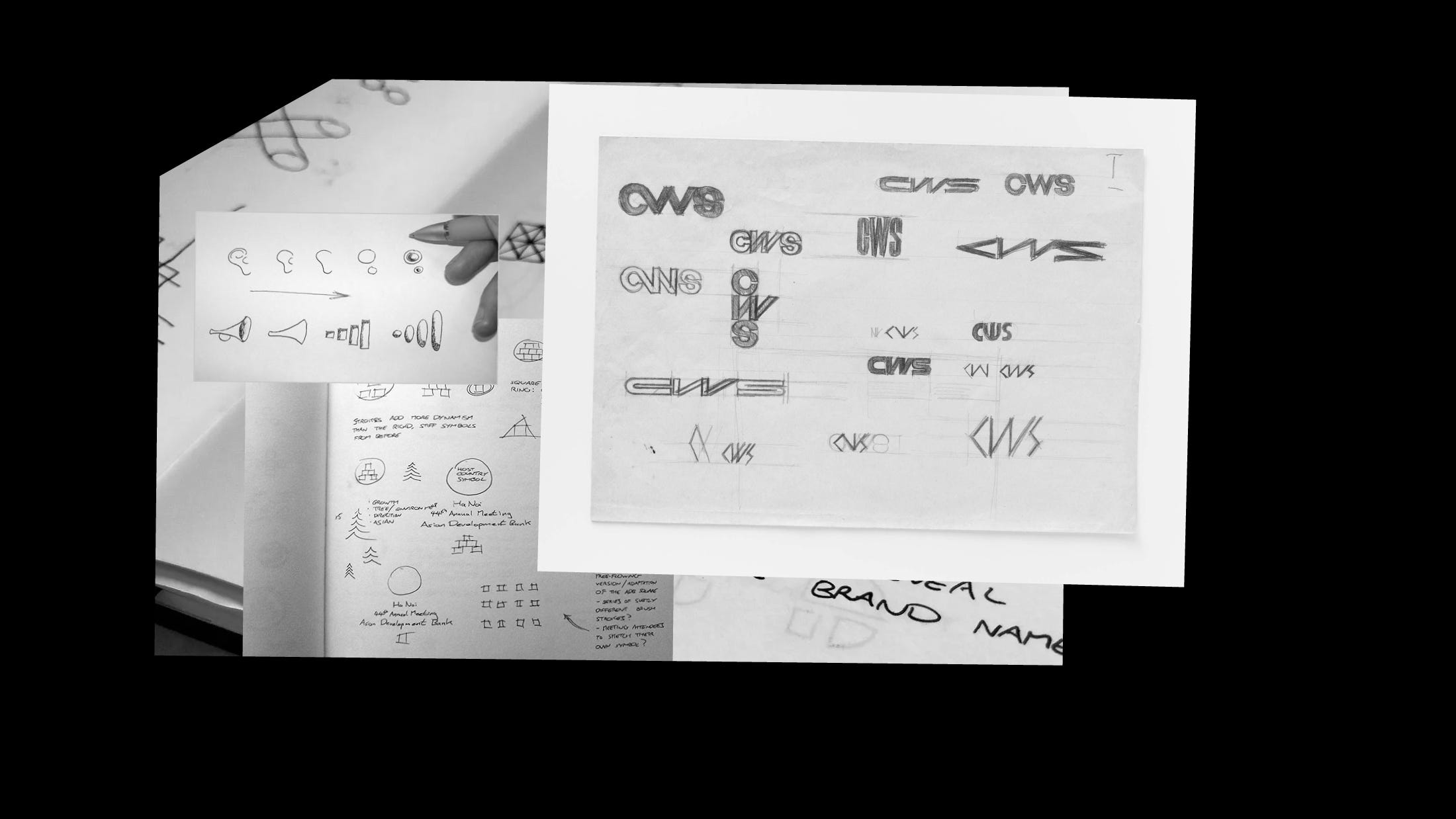
If there are two or three good ideas I’m struggling to choose between, I’ll often show my client one carefully considered sketch for each direction. I’ll describe why they’re strong fit and how they might adapt to various applications. But most of the time sketches go unseen, because it’s my job to show what works, not what doesn’t.
A glimpse into my logo sketchbook.
As always, thanks for being here.
Features from Identity Designed


Monkey Baa is an Australian theatre company empowering young people to shape their lives through inspiring, imaginative theatre and creative experiences. “We created a suite of simple, playful and expressive brand characters to give the team an ownable asset that could easily evolve and change over time.”


The Bond is a new creative content hub for the Midlands, England. “The metamorphic identity, born from both the iconic architecture and its new purpose as a content hub, tells the story of one of Digbeth’s landmark industrial developments.”


One of the most prominent Polish cultural institutions, the National Museum in Gdańsk (Muzeum Narodowe w Gdańsku in Polish), has opened a new chapter. “Our goal was both simple and challenging: Creating an unobtrusive brand identity that is highly adjustable, flexible, and resistant to constantly changing trends.”
And from Logo Design Love


The logo for Paris 2024 combines three separate symbols — the gold medal, the flame, and Marianne (the personification of the French Republic).


A lovely example of when the logo and packaging design work together for a fitting, distinctive result. See more on Denomination’s work for Uovo, the wine brand by Larry Cherubino.


One of the first projects Pixar completed was the short film “Luxo Jr.” It was John Lasseter’s official directorial debut, and became the first 3D computer animated film to be nominated for an Oscar (Best Short Film, Animated). With that, Luxo Jr. became an integral part of the Pixar branding. The Pixar logo and the hopping desk lamp.
Last, not least…
Charmed by the artistic chalk-drawings of David Zinn. Making footpaths happier.
In a short post on his Ace Jet 170 blog, Richard Weston fondly remembers the Illford “starburst” identity, crafted by Design Research Unit in 1966.
Good Movies as Old Books, by Matt Stevens. A lovely illustration project.
“Once an unusual logo like Yellow’s is gone, its replacement is certain to be more conventional, more safe, and less interesting.” James I Bowie with an interesting read about what made the Yellow logo great.
Gorgeous hand-cut paper art by Taiwanese-American artist Huntz Liu. Via Converge.
“Dear designer, it will never be perfect, and that’s okay.” — Unknown.
Your support
You can support my humble newsletter by recommending it to others, buying one of my books, or just saying hello (always a pleasure).